You’ve done your customer research, analyzed your data and designed the perfect user acquisition strategy. Now it’s time to create that magical moment when your ad and ideal app user stumble across each other on the feed.
Today’s guide to creative assets that convert is all about that moment. It’s about helping your ad stand out, about starting a conversation (or continuing a previous one), and connecting your app with the people whose lives it can improve most.
Advertising for apps? Whichever Creative Assets You Choose, Set Your App Advertising Campaign to Success.
- Choose a Goal
You can achieve every conversion goal you want for your app, you just can’t achieve all the conversion goals with one single ad. Choose a goal first, then reverse engineer the creative assets that will help you get there.
- Be Inclusive
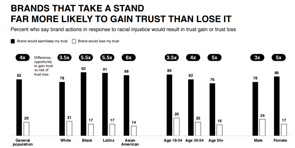
82% of people believe brands must take a stand on social issues to earn their trust, revealed the 2020 Edelman report. 60% even said it impacts their purchase decisions.
The easiest way to start? Be inclusive. Showcase a range of genders, ethnicities, ages and abilities.

Source: Edelman
- Create Instant Trust
Whenever possible, include trust triggers in your campaign – success stories, testimonials, amount of customers, recognizable customers, everyday app users just like the ad viewer, coverage in popular media, you name it.
- Analyze and Tweak
Review your assets periodically to make sure they align with your app’s message and the current times. Rotate assets in a previously-determined, strategic order. Analyze conversions, let go of what doesn’t work, and create more of what does.
Best Practices for HTML5 Assets
- Draw Attention Strategically
Animate the beginning of your ad to draw immediate attention to it in a busy feed. Also animate the most important part of your ad – for example, your product – to help it stand out within the ad experience
- Tell a Story
Take advantage of the fact you can include multiple frames in one ad, and use it to share the story behind your app, or the narrative of transformation awaiting those who download it.
But don’t push it. Keep it to 3-5 frames. Otherwise, you risk exceeding both viewer fatigue and platform weight limitations.
- Gamify Your Ad
Make your ad interactive. Let customers answer a quiz, for example, at the end of which they can click through to your app to get the results.
Or let them replay the experience in-ad instead of clicking through right away. For example, give them multiple attempts to ensemble the perfect look out of your brand’s clothing items, before they click through to buy. Or play a small portion of your game multiple times before they download, to build a stronger emotional connection.
- Provide Actionable Guidance
Include captions to direct people to the next step – both in-ad, for a better ad experience, and when it’s time to click through and download your app.
Best Practices for Video Assets
- Make the First Few Seconds Count
Whether you advertise on YouTube and viewers can skip your app within five seconds, or you advertise on Instagram or TikTok, and viewers can skip right away… the first few second influence whether they’ll give your ad a chance.
- “Design for Sound Off, But Delight with Sound On”
If you’ve been advertising on Facebook the past few years, you might have noticed the often-quoted stat that “85% of Facebook video is watched without sound.” Therefore, it’s crucial to add captions to your videos.
However, Facebook itself, which owns Instagram, reports that “60% of Instagram Stories ads were viewed [with the] sound on, and… Instagram Stories ads with sound were perceived as more relevant than those without.”
So, as a creative strategist, Isabelle Quevilly recommended to Facebook advertisers, “design for sound off, but delight with sound on.”
- Make Video Ads Loopable
This might make sense especially on platforms like TikTok, where viewers are used to watching loop after loop of the same short video. But ideally, you’ll want viewers to replay your ad wherever they can, whether it’s on their Instagram feed or on YouTube.
The more time they play your ad, the more connected they’ll feel, and the higher the brand recall will be as well.
Of course, the intention is to move them off the current platform, so you could leave an open ending, requiring them to download your app to know how it ends.
- Align Your Ad Tone with Your Conversion Goal
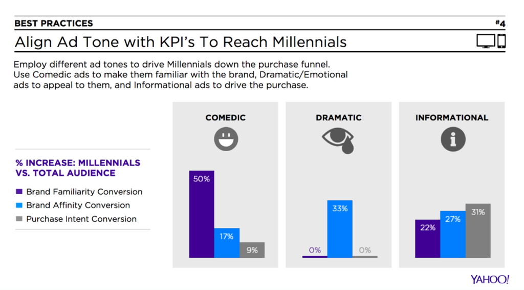
Yahoo, Nielsen & Hunter Qualitative surveyed 14,000 consumers and discovered that different tones help generate different types of conversions in video ads – at least when targeting millennials, according to Clickz.
Check it out:

Source: Yahoo and Nielsen & Hunter Qualitative, via Clickz
Best Practices for Image Assets
- Test Faces vs. Products
Follow LinkedIn‘s example, and test whether your app targets consumers or business buyers. When LinkedIn advertised a business report, it tested a photo of a hand scrolling a phone versus a photo of a human face. The photo with the face converted more downloads.

Source: LinkedIn via YouTube
But your situation might be different. You might want to show how food photos that make customers drool enough to download your app and make a purchase.
So test it out.
- Test Product Focus
If you do feature products, test just how closely to zoom in on them. Maybe for one app, closing in on red shoes will convert better, because it will emphasize the unique features this pair of shoes has.

Source: Zazabest
But maybe for another app, or for a different audience sector, a photo of a woman wearing red boots to a picnic of sweet potato soup and pumpkin spice drinks, set against the backdrop of mountains covered in fall colors, will create a greater urgency to “buy now.”
- Test Complimentary vs. Contrasting Colors
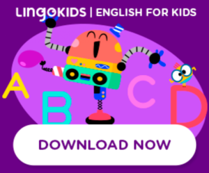
You might need the contrasting colors to pop up on a busy page or feed, and fight banner blindness, but again, every audience is different.

Source: Lingokids
Maybe the soothing or inspiring aesthetic of complementary colors is what will get your specific customers wanting more.

Source: Wowcher
- Let the Visual Tell the Story
Amplify your ad with copy, but make the image 80-ish% of your banner ad. Remember that some people will see it on mobile. The more text you add, the smaller the font needs to be… and the harder it is to read.
On that note…
Unless you do it to qualify your audience – say, your app targets a specific type of artist – don’t add all the visual details to one image. Your image needs to be interesting, but it needs to be easy enough to understand within a mere second or two, even on a small screen.

Source: NordVPN
If you need to show more details before customers download your app, create additional banners for the campaign, or direct them to a landing page to learn more.
Bonus Tip for advertising app: Gain Deeper Data
Data is crucial in understanding how well your creative assets are performing for you, and how to improve your user acquisition efforts.
Make sure you use an advertising platform that lets you compare campaigns in an efficient way. If you partner with a platform that lets you leverage one channel’s data to empower results on other channels, even better.
Zoomd offers 3 solutions that do that. You can check them out here, and see which one is best for you. But either way, remember – always be testing.


